

Best responsive web design examples and design techniques — that’s what you came for, right? If you want sites that adapt smoothly across phones, tablets, and desktops, you need to understand the basics of responsive web design. Some of these basics consist of mobile-first planning, flexible grids, smart media queries, and device breakpoints.
Estimated reading time:
21 minutes
Updated:
Table of contents
- What is Responsive Web Design?
- History and Evolution
- Why Responsive Web Design Matters in 2025
- Fluid Grids and Layouts
- Breakpoints and Media Queries
- Responsive Images and SVGs
- Adaptive Containers & Flexible Components
- Responsive Typography
- Card UI Patterns
- Responsive Web Design Best Practices
- Inspiring Responsive Web Design Examples (2025)
In this guide, we’ll:
- Show inspiring, real-world examples.
- Share practical best practices such as:
- Responsive images
- SVGs
- Scalable typography
- Accessible colour contrast
- Thumb-friendly navigation
- Performance improvements:
- Compression
- Lazy loading
Ready? Let’s jump into the best responsive web design examples and design techniques for 2025.
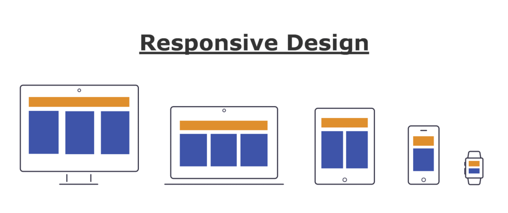
What is Responsive Web Design?
Responsive web design means making your website look great and work well on every device and screen size. Whether someone visits your site on a phone, tablet, laptop, or giant 4K monitor, it should feel easy and smooth. Responsive web design uses flexible layouts, images that scale, and smart CSS rules (media queries) so websites adapt naturally.
The main principles of responsive web design include:
- Fluid grids: Instead of fixed pixel sizes, the layout uses percentages to size elements.
- Flexible images: Pictures resize automatically to fit their containers, so they never overflow or look awkward.
- Media queries: Special CSS code tells the site how to change styles for different devices and screen sizes.
- Consistency: Every part of the site, from buttons to text and images, adjusts smoothly.
- Touch-friendly elements: Clickable areas are easy to tap on a phone.
These basics make websites more usable, easier to manage, and more future-proof. Check out resources like MDN Web Docs or GeeksforGeeks for more on these principles.
History and Evolution
The story of responsive web design begins in the early days of the internet, when most websites were designed for large desktop screens. When smartphones and tablets took over, web developers had to create separate mobile versions of their sites. But this was clunky and hard to keep updated.
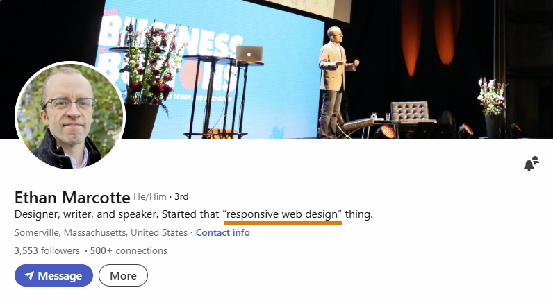
In 2010, a significant change happened. Ethan Marcotte coined the term “responsive web design” in an article for A List Apart. He suggested using fluid grids, flexible images, and media queries together. This new strategy made it possible to have just one site that works everywhere.
Since then, responsive design has become the standard. Developers stopped making different versions for every device. Instead, everyone started using CSS media queries, flexible units, and better frameworks to create sites that look awesome no matter how you view them.
As device diversity exploded (think smart TVs, foldables, wearables), responsive design evolved to fit new contexts. Now in 2025, it’s not only about different devices but also about accessibility, performance, and delivering the fastest, smoothest experience for every visitor.
Why Responsive Web Design Matters in 2025
Responsive web design is more critical than ever in 2025. People use phones, tablets, laptops, desktops, smart displays, and even wearables to browse the web. Some users switch between devices all day. A site that doesn’t adapt instantly risks losing visitors.
Here’s why responsive design is crucial in 2025:
- User experience: Visitors expect fast, easy navigation and explicit content, no matter their device.
- SEO (Search Engine Optimisation): Google uses mobile-first indexing, ranking websites higher if they are mobile-friendly.
- Accessibility: Responsive sites help people with disabilities and ensure everyone can use your website, meeting legal requirements.
- Conversion rates: Shops and businesses lose sales if their page is hard to use on a phone.
- Cost and maintenance: One responsive site is cheaper and easier to manage than multiple versions.
- Future-proofing: The web will keep changing, and new devices will appear. Responsive design helps you stay ready for anything.
In short, responsive web design is not a trend, but a necessity in 2025. If your site isn’t responsive, it’s falling behind. Users will bounce, and your search ranking will drop. Make your website shine on every screen, and you’ll keep your audience happy—and coming back for more!
Fluid Grids and Layouts
Fluid grids and layouts are the backbone of responsive web design. Instead of using fixed pixel units, fluid grids use percentages or other relative units like vw or em that allows every element to scale based on the size of the screen. This way, as a visitor switches from a large desktop screen to a small mobile device, the whole site flows to fit smoothly—no horizontal scrolling or squished content!
In 2025, designers rely heavily on CSS Grid and Flexbox to create these fluid layouts. These tools give precise control over how columns, rows, and spaces adapt. Fluid grids let you specify different layouts for various breakpoints, making sites look professional at any screen size. The most common grid systems use 12 or 16 columns for flexibility, but always focus on what suits your content best.
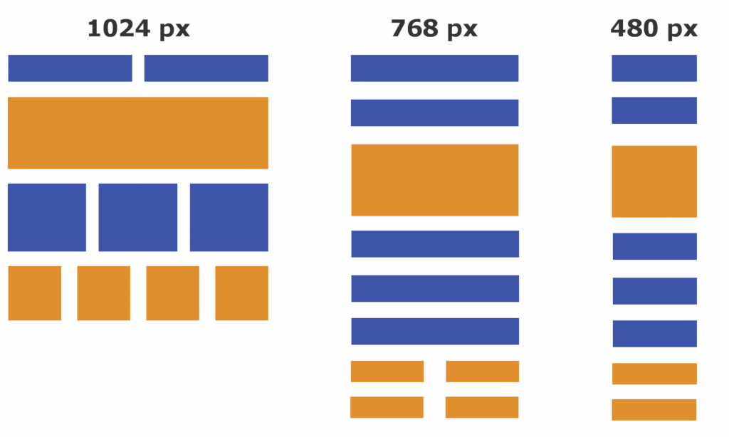
Breakpoints and Media Queries
Breakpoints and media queries are what help your site know when to change layouts. Breakpoints are the specific screen widths where your design will “break” into a new arrangement—for example, one layout for desktops, another for tablets, and another for mobile.
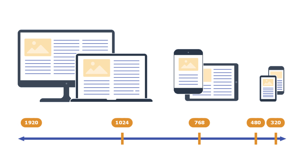
Media queries are the CSS rules that trigger these layout shifts at chosen breakpoints. In 2025, typical breakpoints are around 480px (mobile), 768px (tablet), 1024px (small desktops/laptops), and 1366px+ (large desktops). But you can always add custom ones based on your layout’s needs. Media queries let you change everything from font sizes to grid setup, making your site flexible and user-friendly.
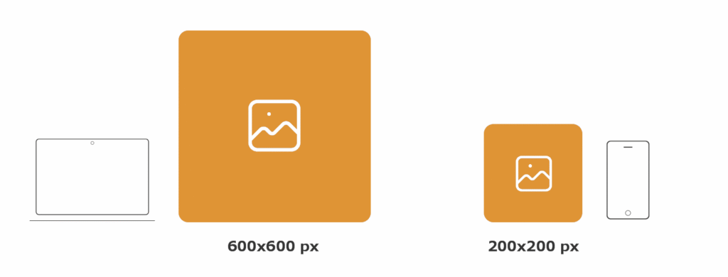
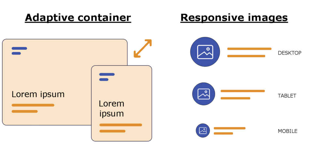
Responsive Images and SVGs
Responsive images and SVGs make sure visuals look sharp and load quickly on any device. In 2025, responsive images use HTML’s srcset and sizes attributes to load the right image size for every screen, saving bandwidth and boosting speed. Aim for 1920px or 2560px as a maximum width, but provide smaller versions for phones and tablets.
SVGs (Scalable Vector Graphics) are even more flexible. As code-based images, they scale perfectly—from icons on tiny screens to crisp logos on huge monitors—without getting blurry or pixelated. SVGs are also easy to style with CSS, and they load super fast because they’re lightweight. Always use SVGs for icons, logos, and illustrations whenever possible.
Adaptive Containers & Flexible Components
Adaptive containers and flexible components allow for a more modular, future-proof design. Containers serve as wrappers for your page sections, adapting to any screen using max-widths, flexible padding, and margins. Components—like buttons, cards, and forms—are designed to resize and rearrange themselves based on the parent container or the viewport.
In 2025, designers use both Flexbox and CSS Grid for building components that “snap” into new arrangements as needed. Container queries, a recent CSS feature, let styles change based on the container’s size instead of just the viewport, bringing even finer control. This modular approach also makes reusing and maintaining code much easier!
Responsive Typography
Responsive typography ensures text is always readable on every device. Instead of static point sizes, use fluid units like em, rem, or new CSS clamp functions to let font sizes grow or shrink with the viewport. Modern best practice often involves clamp() for heading and body sizes, so your titles look bold and readable on a 4K desktop or a tiny phone.
In 2025, variable fonts are trending, letting you adjust weight, width, and slant with a single font file. Always test your typography at different sizes and check contrast for accessibility. Good responsive typography boosts UX, encourages engagement, and helps keep your SEO strong.
Card UI Patterns
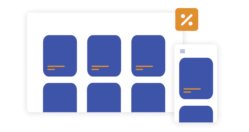
Card UI patterns remain as popular as ever in 2025. Cards are container blocks for grouping related content: articles, products, profiles, and more. They’re naturally suited to responsive design because you can easily stack, arrange, or resize them for different screens.
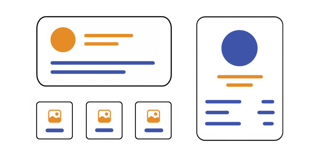
When using card UI patterns, ensure each card is flexible by using percentages or grid gaps, responsive images or SVGs, and appropriate spacing. On a large screen, cards can show up in neat rows; on a mobile device, they shift into a single column. Cards are also great for touch interfaces, providing tappable areas for actions and navigation.
The result? Your content always remains tidy, visually balanced, and interactive—no matter what device your audience uses!
Responsive Web Design Best Practices
Mobile-First Approach
A mobile-first approach means designing the website for mobile devices first and then enhancing it for larger screens. In 2025, most users access websites using their phones. So, starting with a simple, small screen layout ensures your site works well for everyone.
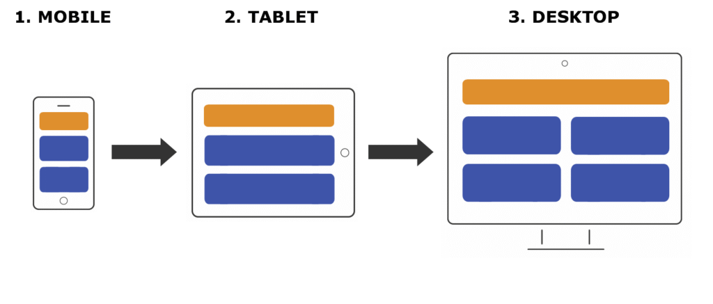
Mobile-first design often leads to a cleaner structure. Developers create designs that naturally scale up, which makes sites faster and easier to use. Remember, it’s easier to add features for bigger screens than to cut down a complex desktop design later. Always test your mobile version thoroughly!
Minimalism and Content Prioritisation
Minimalism and content prioritisation are essential because users want quick access to critical information. This method focuses on removing non-essential elements, keeping pages clean and easy to read. Use short paragraphs, plenty of white space, and only the most relevant images or icons.
Content prioritisation helps guide visitors to what matters most. Place headings, calls to action, and important links at the top or in easily visible spots. This makes your site more useful, especially on small screens. Think “less is more” and focus on clarity, not clutter.
Large Clickable Areas & Touch-Friendly Design
Large clickable areas and touch-friendly design make websites easier to use on phones and tablets. Fingers are bigger than mouse pointers! Buttons and links should be at least 48 pixels tall/wide, with enough space between them to avoid accidental taps.
Feedback is also essential—use colour changes or animations when something is tapped. Touch-friendly actions, like swipe gestures or sticky action buttons, help users interact without frustration. Always check that your clickable elements are easy to use on all devices.
Optimising Navigation: Menus, Drawers, and Sticky Headers
Optimising navigation means making menus, drawers, and sticky headers work smoothly everywhere. On mobiles, use hamburger menus or sliding drawers to save space. Drawers open on a tap, revealing your main links.
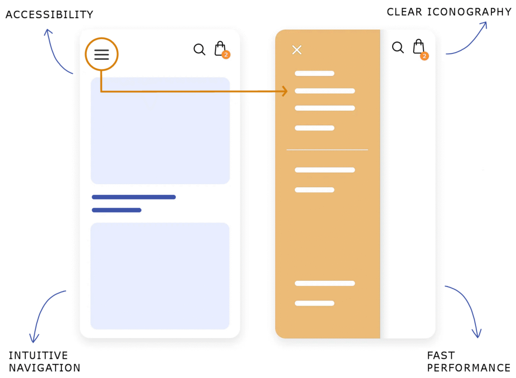
Sticky headers keep menus available at the top as users scroll. This saves time, especially on long pages. Make sure navigation is clear and consistent across devices. Simple icons and short menu labels help users find what they need quickly.
Accessibility Considerations
Accessibility considerations make sure everyone, including people with disabilities, can use your site. Use clear text, high-contrast colours, and large fonts. Add alt text to images for screen readers, and use proper headings so readers can navigate easily.
Make your site keyboard-friendly. Users should be able to tab through all buttons and links. Don’t forget to test your site using screen readers or accessibility tools. Accessible websites are not only ethical but also reach a broader audience.
Fast Loading and Performance Optimisation
Fast loading and performance optimisation keep visitors happy and improve your site’s SEO. Compress images, use modern formats like WebP, and load only what’s needed. Too many scripts or heavy videos slow down your pages.
Try to use lazy loading for images—this loads images only when they’re needed. Minimise CSS and JavaScript files and use caching to make returning visits faster. Test your site speed frequently using tools like Google PageSpeed Insights or Lighthouse.
Cross-Browser and Device Testing
Cross-browser and device testing checks that your site looks and works right everywhere. Not all browsers handle code the same way, and different devices have different screens and features. Test your responsive site on Chrome, Firefox, Safari, Edge, and even older browsers.
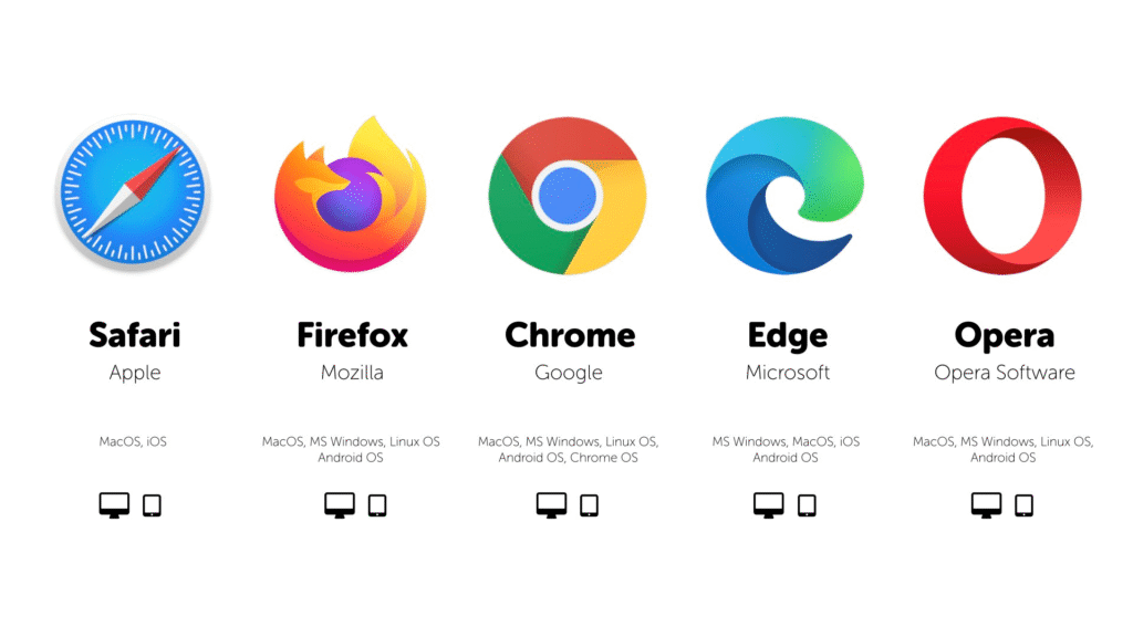
Also, try various smartphones, tablets, and desktops. Tools like BrowserStack or device simulators in Chrome DevTools let you see how your designs behave. Always fix layout problems or broken features quickly.
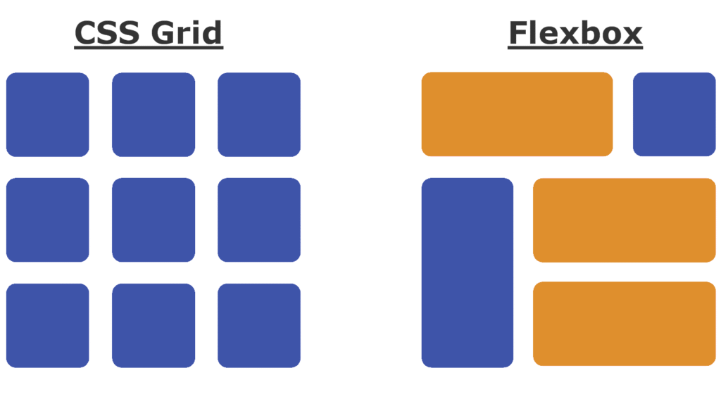
Using CSS Grid and Flexbox for Responsiveness
Using CSS Grid and Flexbox for responsiveness lets you create flexible, powerful layouts. CSS Grid makes it easy to design complex web pages that shift smoothly to fit any screen size. Flexbox is great for arranging items in a row or column and helps with spacing, alignment, and order.
Both technologies replace old, complicated methods like floats. By combining Grid for the main site structure and Flexbox for smaller components, your designs become more stable and easier to maintain.
Regular Updates and User Feedback
Regular updates and user feedback are key to keeping your website effective. Web tech changes fast, so updating code, libraries, and frameworks prevents problems and security risks.
Listening to what real users say is just as important. Add simple feedback forms, survey pop-ups, or track user behaviour. Use this info to fix issues, add helpful features, or improve layout. Continuous improvement keeps your site modern and user-friendly.
Inspiring Responsive Web Design Examples (2025)
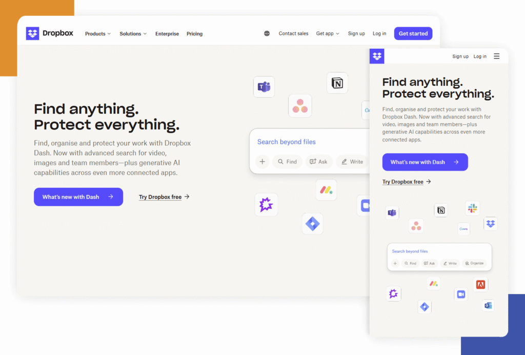
Dropbox
Dropbox is an excellent example of modern responsive web design. The site smoothly resizes from desktop to mobile, keeping all features and navigation easy to use. Dropbox uses a simple grid layout and big buttons, so the experience feels natural on any device. Their colour palette and clean interface help users focus, and images scale perfectly whether on a phone or a large monitor. If you’re looking for a site that manages complexity with visual clarity, Dropbox sets the bar high.
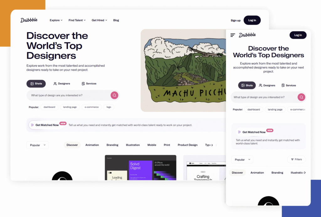
Dribbble
Dribbble shows off how to handle creative content with responsiveness in mind. Design portfolios and shots adapt to any screen size, and the navigation stays intuitive. The feed of images and artwork adjusts fluidly, making it simple to browse from mobile or desktop. Dribbble’s search and filter tools work just as well on small screens, so designers can always find inspiration or showcase their work. Bold use of whitespace keeps the interface feeling uncluttered even on a tight screen.
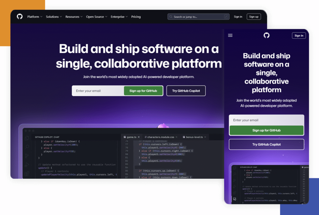
GitHub
GitHub is popular among developers and is also a leader in responsive web application design. The repository layout, code previews, and interactive elements remain accessible and readable at every width. GitHub uses flexible columns, stackable menus, and dropdowns that switch to icons or hidden drawers on small screens. Version control actions remain front and centre to ensure users don’t lose access to critical tools when resizing their browser.
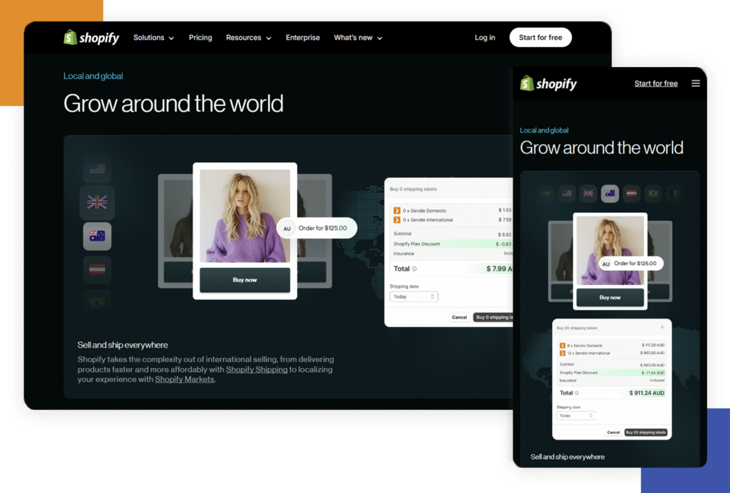
Shopify
Shopify’s main website and online store themes are textbook responsive design. Product listings, images, and checkout processes automatically rearrange for different devices, making shopping easy on any screen. Shopify also uses clear, legible fonts and large buttons for fast, frustration-free navigation on phones. Their mobile-first approach is visible in the way content loads quickly and interactions require minimal typing or scrolling.
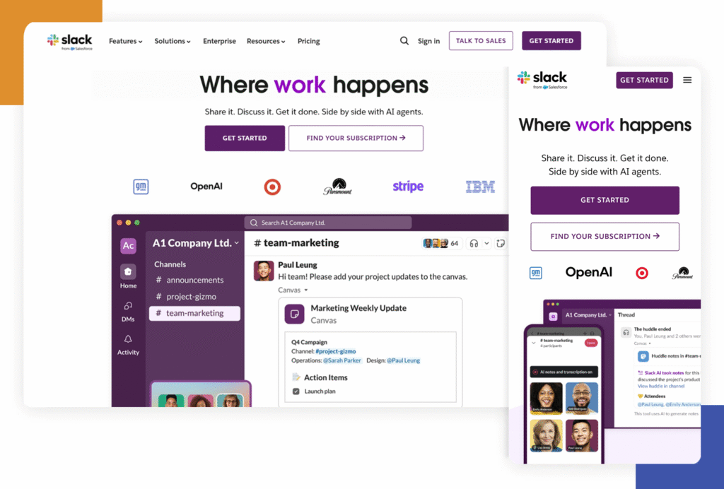
Slack
Slack uses responsive grids and flexible containers to keep messages, channels, and controls usable on any device. The sidebar menu turns into a sliding drawer on mobile, and the text remains readable with bold contrasts and smart colour usage. Even attachments and media display well on small screens, showing how careful planning makes complex apps function beautifully in every context.
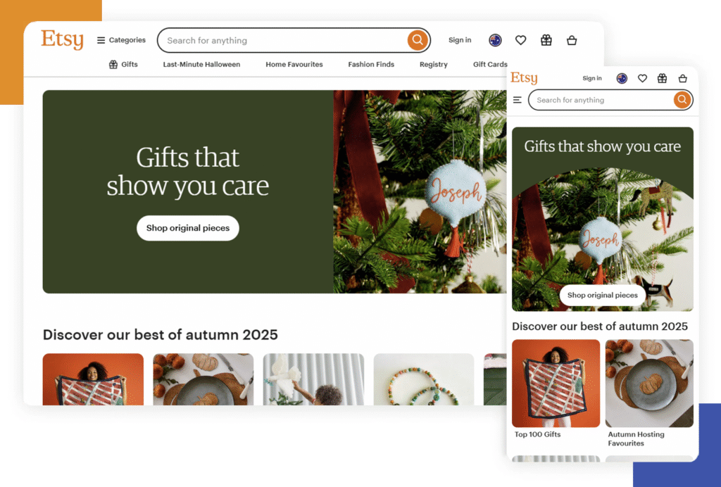
Etsy
For e-commerce inspiration, Etsy shines. Product grids adjust for mobile, letting you easily scroll and explore unique finds. The image galleries are swipe-friendly, making it a pleasure to shop on the go. Navigation adapts with simple icons and sticky headers, so shoppers can always access their cart or profile. Etsy’s responsive design proves that significant marketplaces can still feel personal and inviting on any device.
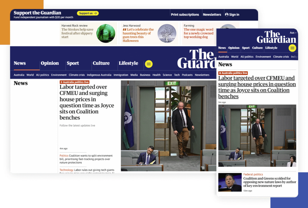
The Guardian
The Guardian demonstrates how news websites can stay readable and engaging on every platform. Article layouts shift so that headlines, images, and text blocks are always balanced and easy to read. Menus collapse into clear icons, and related stories remain accessible without crowding the screen. The design supports both quick skimming and deep reading, showing that journalism websites can work for everyone, everywhere.
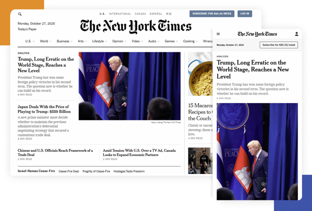
The New York Times
The New York Times also leads in news site responsiveness. Their adaptable structure means images, videos, and graphics look perfect at any size. Dense articles are broken up with pull quotes and large sub-heads, reducing fatigue for mobile readers. Site navigation scales, and interactive charts or graphics work with taps and swipes.
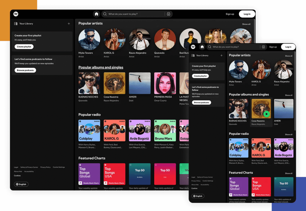
Spotify
Spotify uses bold, colourful tiles and adaptive layouts to make music browsing fun and accessible. Playlists and album art look great even on a small phone, and search remains fast and simple. The controls always stay within thumb’s reach, and content loads quickly—even with lots of visuals. Spotify’s use of responsive animation also keeps the site feeling alive as you switch between screens.
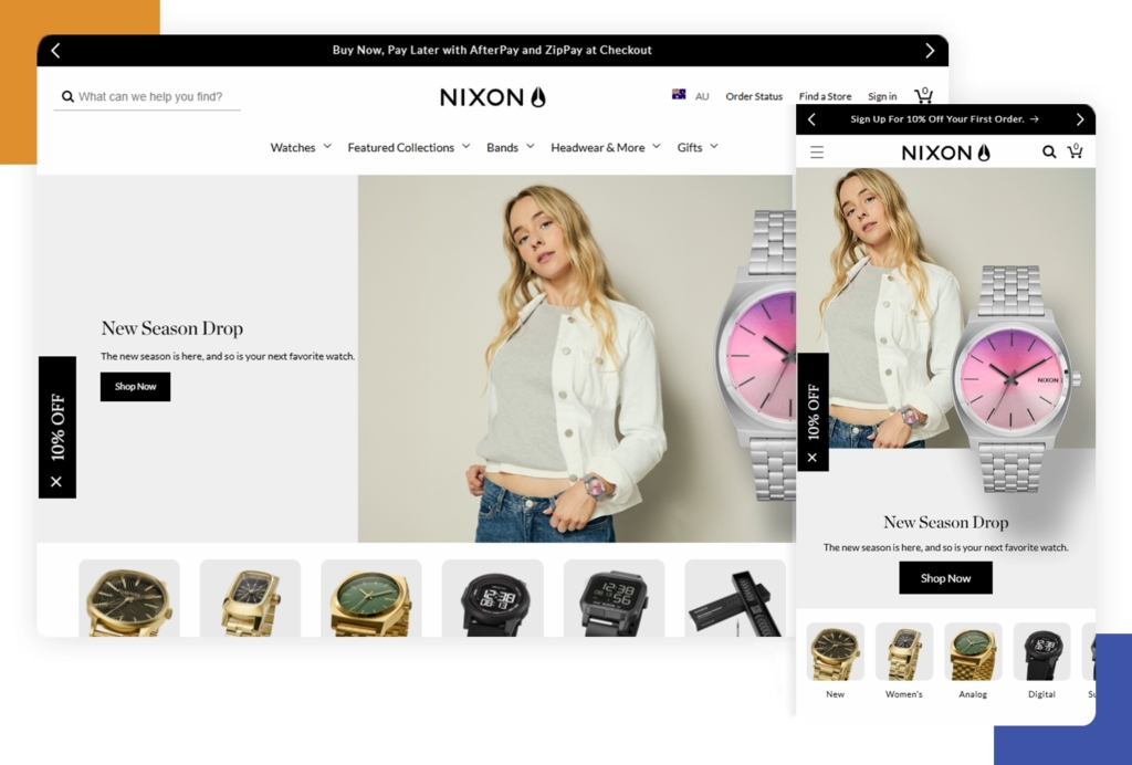
Nixon
Nixon Watches brings luxury e-commerce to life with responsive carousels, interactive product views, and smooth transitions. Their site uses a strong visual hierarchy, guiding shoppers from the landing page to product selection quickly and clearly. The checkout process has been perfected for mobile, with minimal fields and quick gesture-friendly navigation.
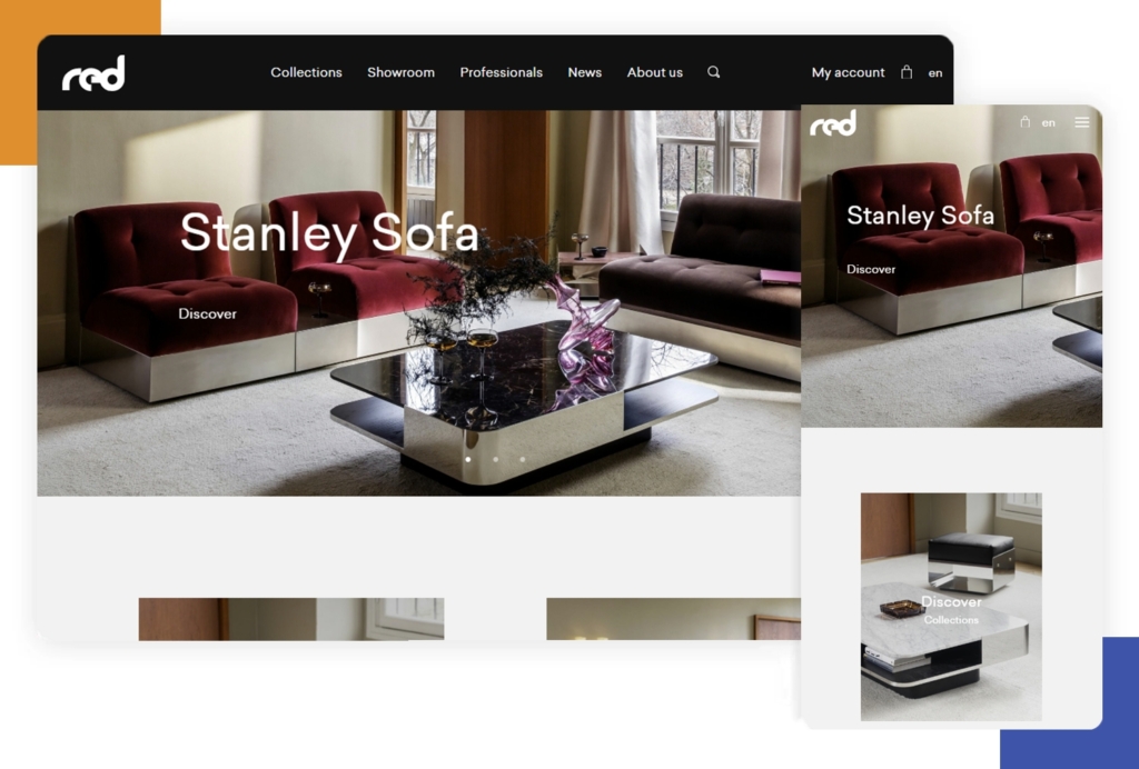
Red Edition
Red Edition’s furniture e-commerce site uses a striking responsive card-based layout. Product images, descriptions, and colour options are accessible from all screens. The home page adapts into easily navigable tiles, and forms remain short and touch-friendly on mobile—making the shopping experience delightful from sofas to smartphones.
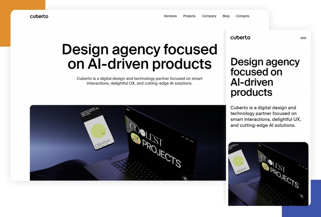
Cuberto
Cuberto is a digital creative studio, and their portfolio is a masterclass in animation and graphics, all while staying responsive. Their slick movement effects and interactive hover states don’t break on mobile—they adapt, staying touch-friendly. Even the navigation is custom-designed to shift from wide desktops to narrow phones without losing any flair.
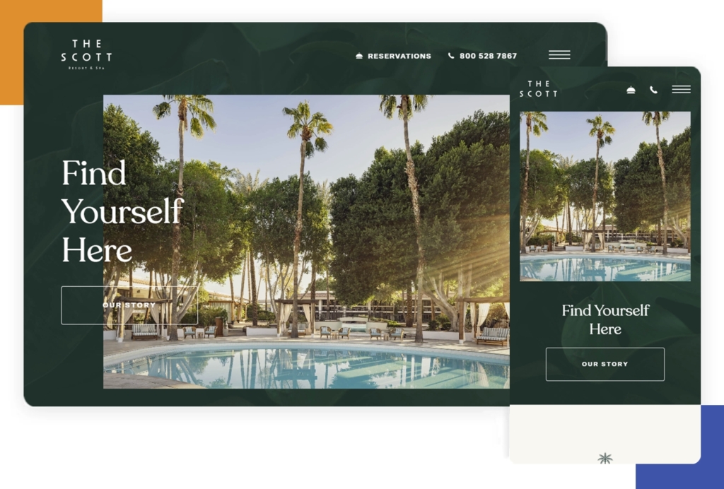
The Scott Resort
The Scott Resort & Spa showcases its hospitality and amenities with a fully responsive visual experience. Large images, booking forms, and special offers display clearly on any device. Interactive tours and sliders scale up or down, with navigation shifting to drawers or sticky bars as needed. Travellers can always book or browse with ease.
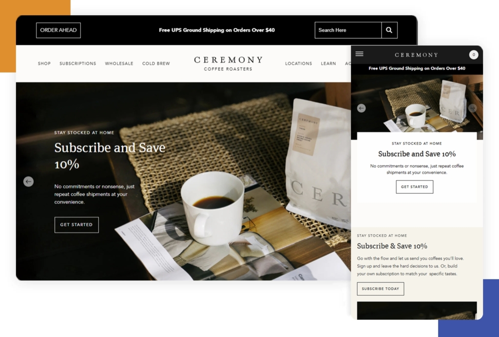
Ceremony Coffee
Ceremony Coffee’s website mimics the experience of a modern coffee shop: simple, fresh, and welcoming. Big images and stories adapt smoothly, and the ordering system is clear and touch-optimised on mobile. Responsive menus, clear CTAs, and fast-loading pages make it easy for coffee lovers to find and buy their favourite blends.
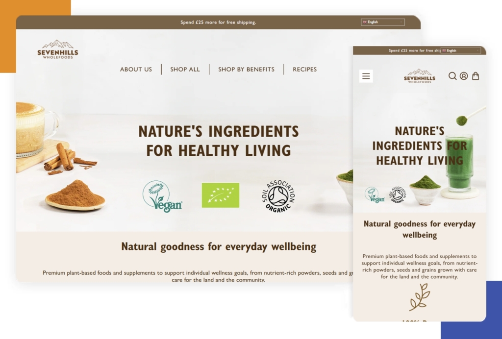
Seven Hills Wholefoods
Seven Hills Wholefoods delivers healthy food inspiration online with responsive grids and vivid, mouth-watering images. The design guides shoppers through products and recipes, with mobile-friendly navigation and clean, readable text. Forms and carts are easy to use on any device.
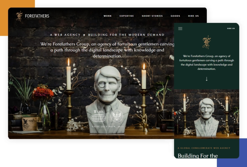
Forefathers Group
The Forefathers Group has a bold, illustrative website that’s fully responsive. Strong typography and hand-drawn graphics stay sharp on any size, and the navigation smartly adapts for fast loading. Their storytelling flows from wide desktops down to mobile without losing impact or style.
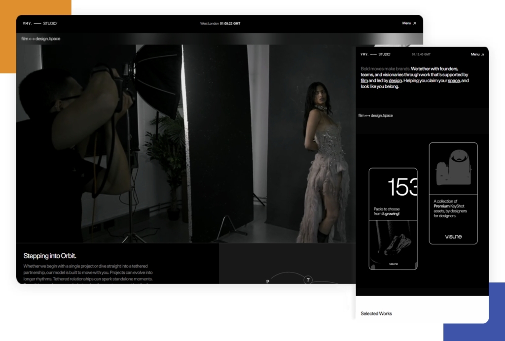
VMV Studio
VMV Studio is a portfolio that shows off modern minimalism and strong animation in a responsive format. Grids and showcase pieces flex to fill the space, and no details are lost between devices. CTAs and forms are always prominent and accessible, making it easy for potential clients to connect.
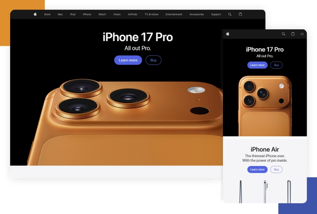
Apple
Apple’s website is world-famous for its super sleek responsiveness. Rich images, videos, and product sliders scale for any screen size without losing speed or quality. Apple uses bold headings and elegant whitespace so that navigation, shopping, and product info are always transparent and accessible. The site feels immersive, interactive, and friendly—no matter what device you use.
All these examples use the core ideas of responsive web design: flexible layouts, adaptive images, and smart navigation. They show just how creative and effective a site can be in 2025, no matter where you view it.


Web design is not merely about aesthetics or the surface-level…
Looking up what custom web design actually means? In simple…